
People all over the world are turning to ecommerce to reduce their potential exposure to COVID-19. But did you know that high cart abandonment rates are actually the norm rather than an exception? In 2018, 75% of online shopping orders were abandoned. So, for every person that completes a purchase on your site, another three people change their minds at the last minute.
But ecommerce conversion rates are growing steadily, including a recent (pre-pandemic) 11.6% improvement in mobile conversions worldwide. How, exactly, are UX specialists lowering historically high abandonment rates? Here are our five essential ingredients for the best checkout experience.
-
Make it a single page… if you can
Long, complicated checkout processes are one of the leading causes of cart abandonment, accounting for 23% of all unfinished transactions. Less is more in ecommerce in 2020, with savvy shoppers increasingly expecting seamless shopping experiences from niche sites and retail giants alike.
Single-page checkouts are often lauded as the ideal solution because they’re intended to provide users with a faster, simpler way to complete a purchase. If you’re already signed in—with your shipping and billing details saved—you may even be able to complete your task within a few clicks.
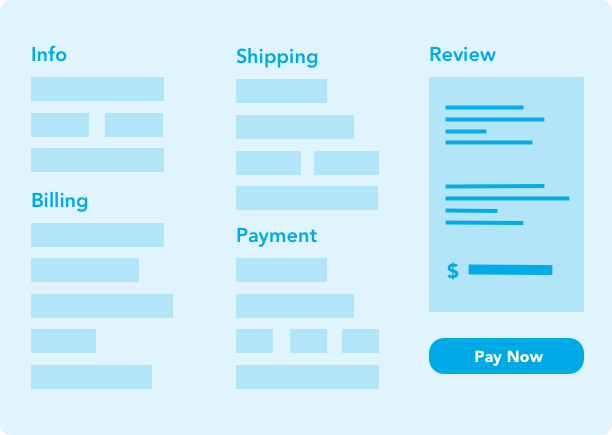
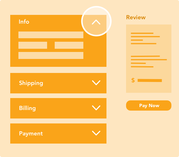
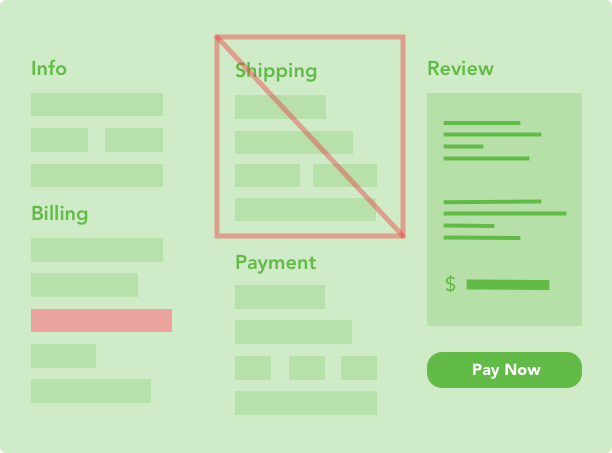
Three types of one-page checkout
Standard: Every field displayed on a single page
Accordion: Reduces cognitive load; imposes order
False: Validation required but not made clear
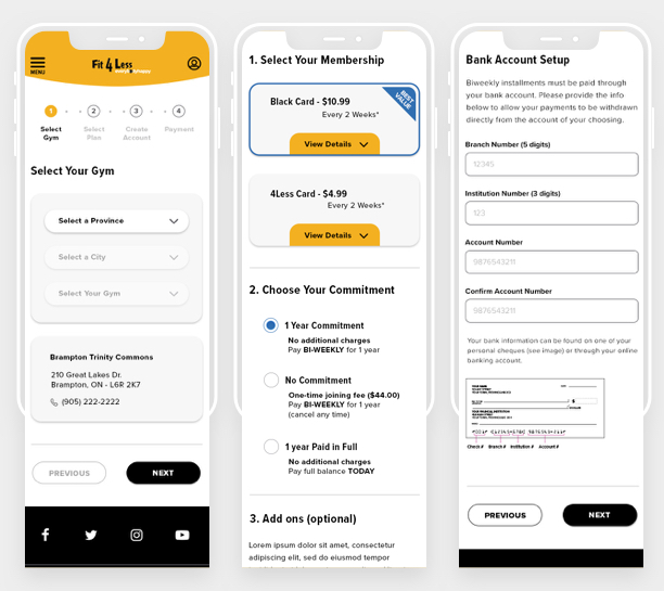
What if one page isn’t an option?
Whether you’re dealing with stringent business requirements or more involved purchases, you may find that you simply have too many fields, steps, and confirmations to fit on a single page. Nobody wants to be presented with an overwhelming desktop checkout or endless scrolling on mobile.
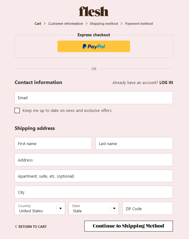
The most important thing is to understand your audience. Certain demographics (including more mature users) may be thrown off by a one-step checkout, instead preferring to be gently guided through a multi-page checkout experience. That’s why many start-ups and smaller brands use Shopify, whose standard checkout template is four pages—and is becoming an accepted norm for online shoppers. Flesh Beauty is a great example:
Think of an online purchase as a banquet meal with several courses: it may be better to break it down into digestible pieces rather than serving up everything on one oversized platter. Just remember to:
- limit yourself to five steps total to reduce bounce;
- display how many steps there are and which step the user is currently on;
- provide input feedback instantly (i.e. error messages) instead of waiting until the end.
-
Only ask for necessary information
Users abandon purchases when they’re asked for seemingly irrelevant data. After all, why would a kitchen supply store or bookseller need to know your job title, company, or middle name? It’s a strong indicator that a business putting its interests above (or at least on a par with) your own.
And you can be sure that certain fields are no longer universally accepted as a given. Your phone number, for example, used to be required in all cases—and entered with no hesitation—but users are now far more circumspect. Why isn’t an email address sufficient in 2020?
If you are compelled to include superfluous fields, make sure they’re not only clearly labeled as optional but also moved to the end of the form. The goal here is to convert users as seamlessly as possible, so don’t let optional fields get in the way!
-
Offer guest checkout
Extra costs like shipping, taxes, and fees are the leading cause of cart abandonment (53%), but can you guess what’s in second place? The lack of a guest checkout (“The site wanted me to create an account”) accounts for an astonishing 31% of unfinished ecommerce transactions.
We get it: most businesses would rather have users create accounts so they can connect with them in future and nurture brand loyalty. It’s the ideal outcome for marketers—but it’s not necessarily ideal for increasingly privacy-minded customers.
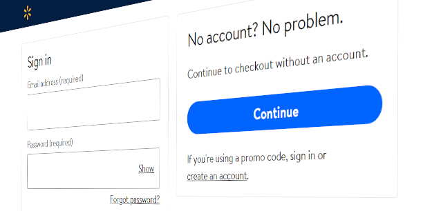
Ecommerce shoppers don’t always want to create user accounts, especially for smaller sites or for purchases they only intend to make once. If they’re not able to check out as a guest, there’s a good chance they’ll simply take their dollars elsewhere rather than be forced to register. To start reducing your abandonment rate, deprioritise data capture and make guest checkout happen.
If you want the best of both worlds—easy transaction and new user account created—end your guest checkout process with a subtle message on the confirmation page: “Why not add a password while you’re here?” All other required data has already been entered and confirmed, so at this point it’s not a big deal to create a password for future convenience. Consider pairing it with a coupon for extra appeal.
-
Optimise for mobile devices
Although mobile devices account for more than half of all ecommerce traffic, mobile has the highest cart abandonment rate at 86% (compared to 73% for desktop). The smaller the screen, the more likely users are to give up on their purchases—but it may be easier than you think to satisfy your smartphone shoppers.
- Visual indicators help a lot, so make clickable buttons larger and more visible. Also consider making the main button sticky at the bottom of the screen, but make sure it’s clearly greyed out or disabled until all necessary fields have been filled.
- Reduce image sizes to minimise loading time. Lazy loading can also help increase mobile page speeds.
- Prominently display all relevant trust indicators (e.g. “This is a secure 256-bit SSL encrypted payment transaction”).
- Align your forms vertically to facilitate navigation. For mobile, that means stacking fields on top of one another in a single column for maximum accessibility.
- Remove distractions such as ads and pop-ups, and limit points of exit to encourage shoppers to complete the transaction. Sometimes giving the purchase funnel its own distinct visual treatment can help indicate a change of task at hand.
- Consider accepting mobile-specific payment options, especially those with thumbprint recognition.
-
Offer more payment options
There’s no such thing as too many options when it comes to getting paid. If you offer support for major credit cards alone, you’ll unwittingly turn away an increasingly significant segment of customers who opt for credit card alternatives including:
- PayPal (277 million active users worldwide)
- Apple Pay (54% market share in the US)
- Google Pay (added 1 million new users in 2019)
Of course, you don’t necessarily have to implement and manage each option individually. With an all-in-one plugin (such as Stripe), you can save time and effort with a solution that covers multiple payment options.
Whichever way you decide to proceed, remember to be upfront about payment options at the earliest opportunity. Nobody wants to fill their cart only to find their preferred payment method isn’t accepted.
A UX investment that literally pays off
Improving the checkout process of your online store should be high on your priority list not only because it has a direct impact on your bottom line. In the current climate, it could also be a vital lifeline to consumers enduring a pandemic. Your primary motivation to optimise should be to improve usability and accessibility—especially for those not accustomed to shopping online. A boosted conversion rate? Well, that’s just a bonus.
Want to know more? We’ve built and optimised purchase funnels across every sector imaginable, and we welcome every opportunity to share our insights into ecommerce UX. Check out our handy single-page checkout infographic and let’s talk.