
With the introduction of the “phablet” and ever-growing physical size of smartphones, the mobile growth trend no longer only applies to the increase in device usage. Browsing on less than 4” screens is on the decline with the majority of consumers taking on the 5” or larger sized smartphone. These gigantic phones have replaced desktops and tablets and now hold a special place on the inside of your palm, making mobile web design a critical element in determining the mobile user experience.
The Mobile Hold
When about 3 hours of a person’s day is spent on their mobile device, it’s important to understand just how these mini-tablets/phablets, the new iteration of “phones,” are held and maneuvered and what those implications are.
The majority of us have had various challenges with adapting to the larger phone. I personally had several instances of phone-to-face collision or balancing my device on my fingers so that my thumb could reach the top left corner of the website. I know I’m not alone.
Although we may not always hold our phone the same way, Steven Hoober’s study illustrated that there are 3 distinct ways a mobile user holds the device:
1. The One Handed (the most popular)
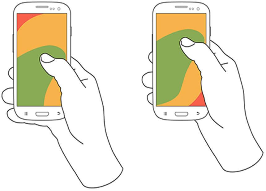
Image via Steve Hoober
This position allows you to maneuver and browse on a page using your thumb.
2. The Cradled (the common)
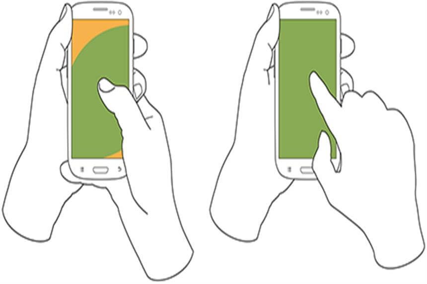
Image via Steve Hoober
This position allows for the thumb and pointer finger to control the screen, however, the majority still resort to using the thumb.
3. The Two Handed— which I call the Texter
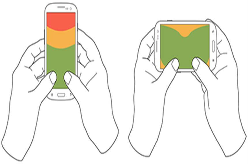
Image via Steve Hoober
Unless you’re using the phone in active mode (ex. gaming, movies), it is rare to find mobile users using the landscape mode while holding the mobile with two hands.
Nonetheless, in all three grips, the thumb plays an increasingly important role in our daily digital lives. Think of all the times you scrolled through Instagram and didn’t use your thumb or texted using your pointer finger…you probably can’t, unless you’re my mom (sorry mom).
The Thumb
Because we no longer have a precise cursor like the mouse, it’s important we learn how to cater to the mighty opposable thumb and its characteristics.
The thumb is both the shortest and chubbiest finger of the bunch making maneuvering a webpage a dexterous task, even with someone who has long “piano” fingers like myself. The thumb zone heat map evolution illustrates how the growth of the display screen decreases and limits our ability to reach across the screen, comfortably.
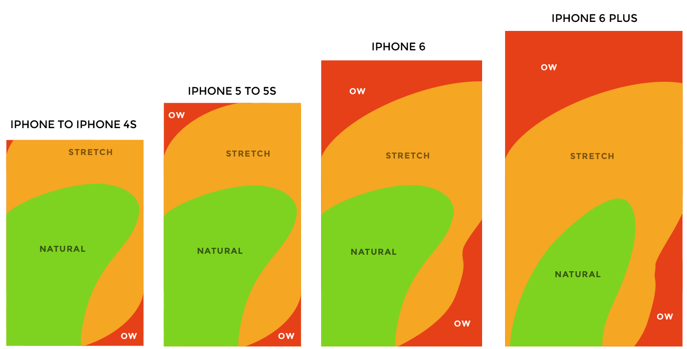
Image via Steve Hoober
With mobile searches exceeding desktop searches, your website needs to deliver the best mobile user experience possible. When designing a mobile friendly website, you must think of how you should design your page for the thumb.
Here are 5 tips that can help:
1. Mobile responsiveness
It seems that this buzzword has already come and gone, but still a large number of sites have yet to adapt to a responsive, mobile friendly version of their site. A website that is responsive has the layout or content automatically restructure itself based on the size of the screen it’s presented on. Having your desktop’s content page planted on a screen that’s 5” will not work wonders for your visitor’s user experience. Adjusting and pinching the screen to zoom in distracts the visitor from their initial intent or the content you want to communicate to them. The website needs to be fluid to maintain a one finger touch browsing experience.
What will you gain in return? When Walmart Canada introduced responsive design in November 2013, they saw a 20% increase in conversion.
2. Target Size Matters
Mobile devices are where users struggle most with hitting touch targets. The concentration, accuracy and orientation required to hit a target can sometimes be as bad as trying to thread a needle. Using the thumb doesn’t make it any easier.
A user’s actual touches are inconsistent, however, they are found closely clustered around the visual target. Visual targets should not be the touch target. Visual targets are for luring your user into taking action. Once successful, you need to make sure your touch targets (the area a user touches to perform an action) are big enough to make it easy for users to tap without error. However, with the limited space on a phone you need to design your webpage strategically and space out your touch targets far enough apart to avoid interference errors (when the proximity of touch targets is too small that you include another target when tapping).
In addition, earlier I showed you how much smaller the “natural” (in green) thumb reach has become relative to the screen size. This has resulted in visitors having a slower and less accurate tap near the top edges and bottom of the screen. In other words, you will need larger targets and greater spacing for those areas to ensure the user is tapping correctly and with ease.
It is recommended that touch targets are at least 8 millimeters apart on center—with 10-millimeter spacing being strongly preferable.
UXmatters has provided a size summary guideline for easy reference:
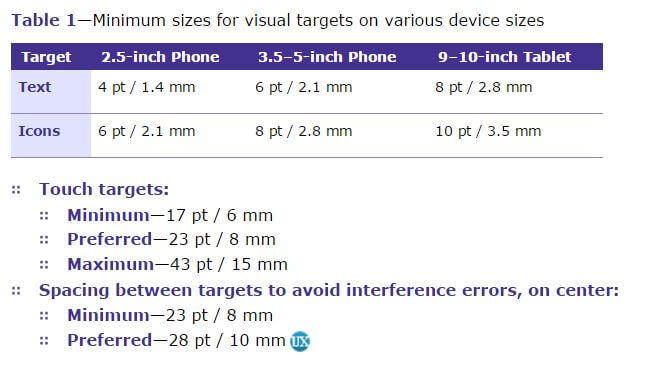
*to avoid interference errors
3. Exploration below the fold
Above the fold is still valuable real-estate, don’t get me wrong, however, the ease of scrolling with your thumb when reading content has turned the action into a habitual motion. On mobile, half of the users start scrolling within 10 seconds and 90% within 14 seconds.
If your page is designed to encourage scrolling, you have just been liberated with more space to provide valuable content for your visitors.
- Keep your site simple. We’ve entered a minimalist time where icons are flattened and symbols are replacing words, so it makes sense that our mobile web design should embrace this less is more Make good use of whitespace and use images to help encourage scrolling.
- Content is key. Provide compelling content that keep your visitors interested. Have it peaking just slightly above the fold to entice the visitor to explore further.
4. Forminimal
Forms serve as an excellent source of enhancing your customer database or providing the user with a specific landing page based on their request. On mobile devices, this may seem like tall order. Clicking the tiny boxes only to fill it out with the tiny virtual keyboard is not an exciting or rewarding experience. However, there are some small tricks from UXbooth that make form filling on a mobile device less of an ordeal. #savethethumb.
- Minimize the number of form fields necessary to achieve the data you require
- Reduce the number of fields that require typing. Choose the appropriate input methods and selection list like a locked drop down or open predictive search to simplify the interaction.
- Increasing the forms’ inputs size. Fingers are much less precise than mouse pointers, so they need bigger targets. Ensuring that both the visual targets and touch targets have enough padding between fields helps the thumb navigate and further enhances user experience. It needs to be large enough to avoid overlap with other touch targets.
- When possible allow for auto-fill. Use native device capabilities from various sources like social networking apps to provide the data so that people don’t have to enter it manually.
- Use top aligned labels. This ensures that the label is still visible as you fill in the field even if the device zooms in on the input field when typing and helps with spacing.
5. Limit the clicks
There are mobile specific features that help reduce the amount of clicks to conversion. When Steve Jobs created the first iPad, he made sure that the user can get to where they wanted in three steps (ex. home>artist>song). Both “tap to call” and Google map integration brings the user closer to the business and turns them into a qualifying lead in fewer taps.
These 5 tips are just the first few steps up the beanstalk towards bringing your website out of the PC age and into the relatively new smartphone era. The rule of thumb is to design your mobile site for the thumb. This will not only help with your mobile user experience, but also ultimately increase conversion rates.
Form more information on ways in which you can improve your user experience and increase engagement, contact a DAC expert.