This is the next blog post in the “Talk Data to Me” series and the 3rd (out of 4) on the “Dashboard Know-How Guide”. Our previous case study looked at a travel agency that wanted to trace both online enquiries and offline conversions in one dashboard.
The scenario:
Jana is the digital director of an online sports retailing company. She is becoming more and more aware of the importance of placing customers at the centre of her company’s strategy. The first step in the strategy process involves segmenting her customer base according to shopping behaviour, socio-demographic profile, intent, and many other things.
Ideally, she wants to be able to receive a 360-degree view of these key segments and begin to understand and action on seasonality and changing shopping behaviours across historic data.
The solution:
Jana was presented with the below customer segments dashboard.

This dashboard is an essential tool for housing and understanding scattered data, providing a customer-centric vision in one interactive platform. With it, Jana can evaluate key metrics like her main KPIs, device behaviour and performance against previous year. Additionally, it is segmented for each of the key audiences, helping to inform a personalised strategy for each group!
This is truly revolutionary for her business, as she can now make data-driven decisions affecting all areas, including paid search, product development, etc.
Looking at this scenario, it is clear that a simple and insightful dashboard is key to exploring insights and making effective data-driven decisions.
While there are multiple different software tools out there to build a dashboard, there a few tips you should bear in mind when going through this process regardless of the software tool you choose.
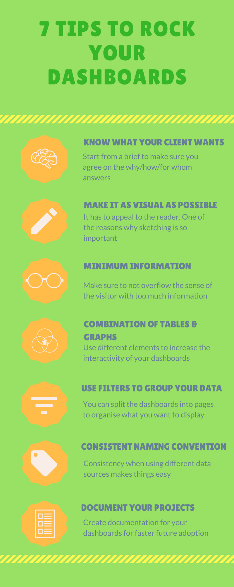
Our top 7 tips to creating the ideal dashboard
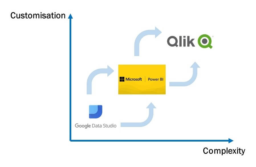
Dashboard software tools have developed hugely over the last few years. In a previous introductory post about visualisations, we mentioned the visualisation tool that made possible the creation of a full 360-degree view of consumers: Microsoft Power BI.
Let’s take a closer look at this powerful tool…
Power BI: Microsoft’s viz tool
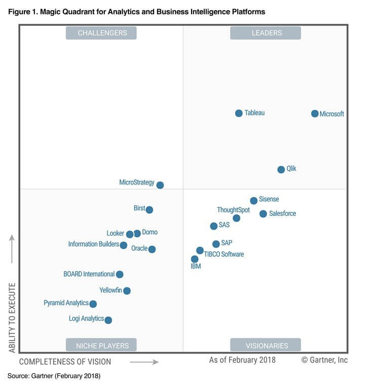
Microsoft’s answer to Google’s investment in a visualisation tool came in July 2015, when Microsoft Power BI became available to the public. Developed by Microsoft, it is able to analyse data and share the insights using highly customisable dashboards. It has helped Microsoft position itself for the 11th consecutive year as a leader in the Gartner’s 2018 Magic Quadrant for Analysis and Business Intelligence Platform (see below for quadrant).
Power BI can be accessed in a Desktop version or in the Cloud version of the product (and recently the launch of a mobile version). A free version is available (with a storage capacity up to 1 GB/user), or as a pro version (for $9.99 / month with a maximum capacity of 10 GB/user) which offers a more advanced set of tools.
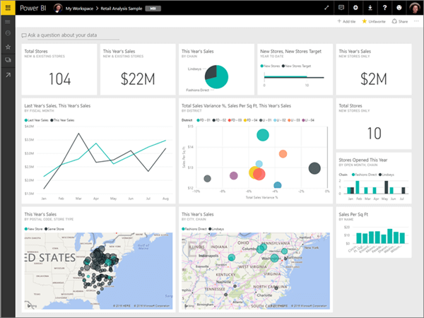
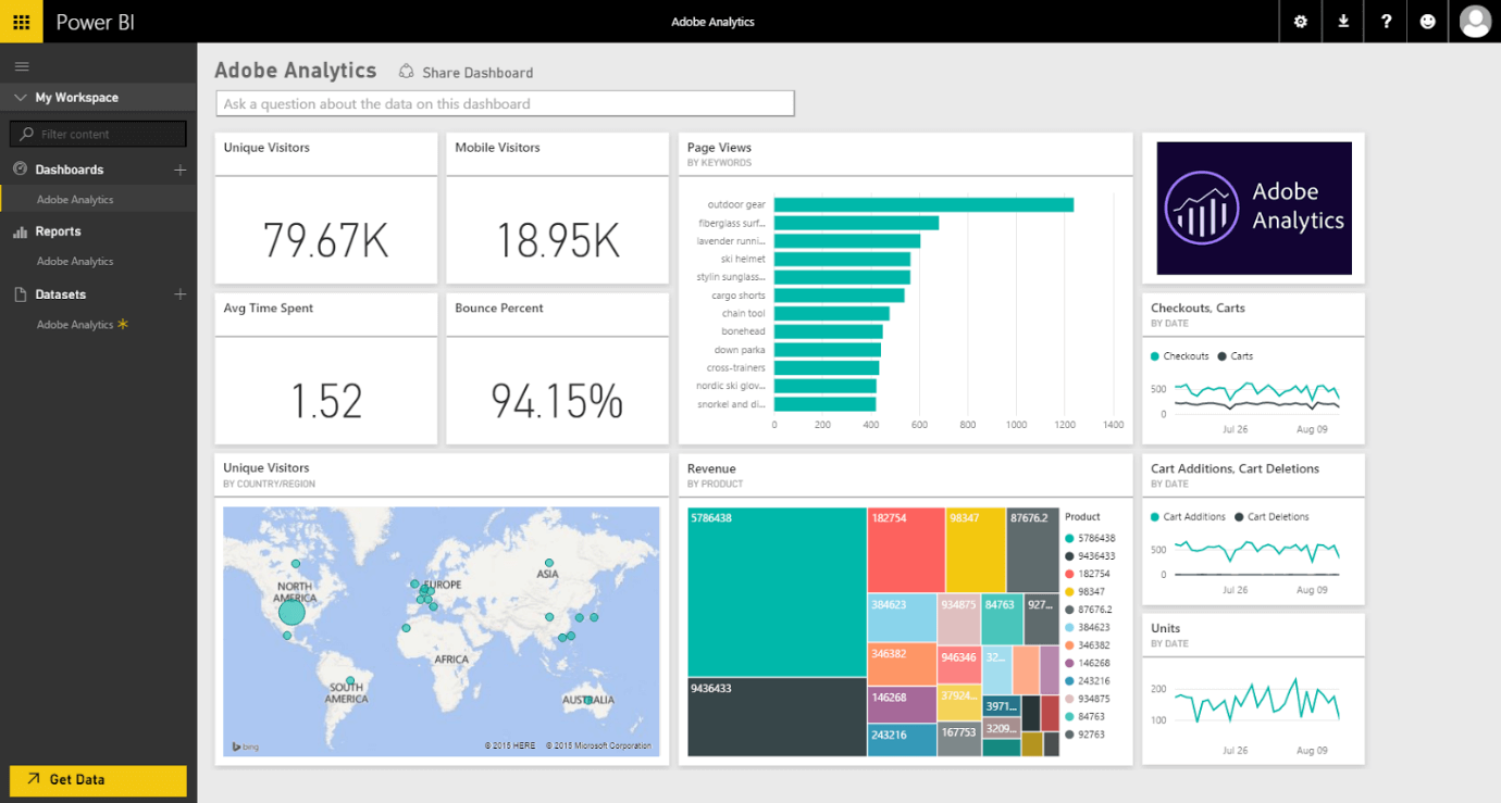
Here is another example of a dashboard in Power BI:
What does Power BI offer?
Power BI offers highly customisable and flexible dashboards, together with interesting pre-processing features to allow for data exploration and cleaning before you being building your visualisations. This pre-processing includes SQL querying and natural language possibilities. Furthermore, like Data Studio, it allows for report sharing and online publication.
There are different ways of sharing/publishing:
- They can be published to the Microsoft servers and made available for the whole internet;
- They can be shared with individual users (restriction: this requires the other user to have a Power BI Pro account)
- Download the reports in different formats.
Regarding data connections, Power BI provides a long list of connectors and possibilities for importing data (excel file upload or CSV imports). Like other visualisation tools, new connectors are added as the tool is developed (testing connections are in beta mode). Nonetheless, Power BI presents some difficulties with connecting to various sources as you are required to purchase additional Microsoft services to make use of them. Additionally, Power BI does not work with the Mac and Linux operating systems.
A special mention should be made to the recent agreement between Adobe and Microsoft to offer a “set of joint enterprise solutions designed to help companies improve the customer experience for their clients”. This, in practical terms, means that there will be powerful connections between both platforms to boost the combined experience.
What does all this mean for me?
All in all, Power BI is a very interesting and flexible tool available to build dashboards. However, it requires advanced skills due to its steep learning curve. It is a tool to use when you want to take a further step in your visualisations and become more creative in the graphs and elements you include.
The next blog post (and final of the series) will look at another powerful tool for visualisations that also has a steep learning curve but provides very impressive results for projects: Qlik Sense.
If you have any queries about the above or want to hear more, one of our experts will be able to help.
Contact DAC today to find out more!