This is the 5th post in the series of blog posts in the “Talk data to me” series and the 2nd (out of the 4) on the specific topic of visualisations included under the title “Dashboard Know-How Guide”.
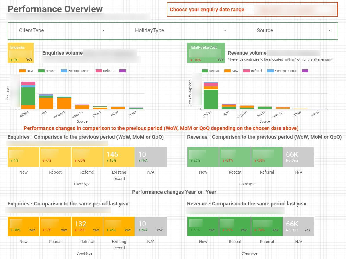
This is the 2nd Case study we present for the use of dashboards in real business situations. Our last post included a case study dedicated to building a dashboard for a retailer that wanted to understand its SEO performance and how to improve it. In this post we will: First, look at an overview of a road-map to building a dashboard; and then we will dive a bit deeper into the first of the visualisation tools compared in last post: Google Data Studio.
Road-map to the building of a dashboard
The beauty of building insightful dashboards requires a series of steps to ensure a good documentation and implementation. This process is particularly important to be efficient and avoid over-cost and delays in launching.
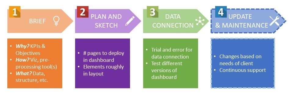
- The 1st step in the creation of a dashboard report is to define the objective for the dashboard, who are going to be the stakeholders and other relevant information (including Software tool: See last week’s post on different viz tools). This is usually formalised in the form of a brief
- The 2nd step consists of a planning and sketching of which data you want to use. Also, you should have an idea in mind of how you want the elements to be displayed.
- The 3rd step is connecting to the data sources and creating a new report
- The final step consists of the Maintenance & Update of the content and data in the dashboard. This stage involves introducing changes based on the clients’ needs, always keeping up-to-date with new opportunities to provide a more insightful analysis. This step also includes producing documentation to keep record of everything regarding the dashboard.
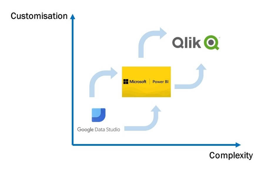
As mentioned in our last post introducing Dashboards, our Analytics and Data Research team have experience working with different visualisation tools. The decision of choosing one or the other is very much linked to the necessities of your business or project. Together with the feature comparison table from our last post, the figure below provides a simple diagram of the road-map in choosing the most suited viz tool for you. Let’s now address the first step in the graph.
Google Data Studio: Google’s viz tool
Google launched in 2016 a free tool to simplify the data connection and building interactive and easily-shareable dashboards: Google Data Studio. It is still in beta mode, as continuous updates are being aggregated. Like the other visualisation tools, it has benefits and drawbacks, which we will explore in more detail soon.
Data Studio was born to make data available to everyone across an organisation. It makes data insights relevant to the different areas of responsibility. Moreover, Data Studio is built with the purpose in mind of becoming a collaborative tool. It allows for joint editing of reports in real time.
Source: searchengineland.com
There is a wide variety of data sources you can import data from. It ranges from Google Analytics to Google Big Query, including different SQL platforms and other Google Tools (Attribution 360, AdWords, etc.). As you can see, the possibilities are great. Our experience using Big Query yields very good results. It acts as an online data warehouse which stores all the data merged from different sources in a stable and secure way.
Once you review the different variables from the data sources, it’s time to start putting those sketches into the dashboard. Data Studio offers a variety of charts and summarising elements like scorecards (i.e. summaries of variables). For instance, you would be able to compare how the keyword search volume traduces into revenue for your website on a monthly/weekly/period basis.
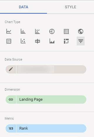
However, it has some limitations in terms of types of charts you can build (see image above) which affects the flexibility of the dashboard. It also doesn’t offer great interaction features within the dashboard. Moreover, it requires an important effort in cleaning and pre-processing of all the data before connecting it to the tool. Data Studio doesn’t have many functionalities for data cleaning/transformation.
Next steps
To summarise, Google Data Studio is a suitable solution when you are entering the world of dashboards for the first time. It has a gradual learning curve and relatively user-friendly but is limited in terms of customisation features. In the case you are looking for a more sophisticated tool, the next post (3rd in the “Dashboard Know-How Guide” series) will cover Microsoft PowerBi in more depth. We will also present 7 relevant tips for building clear and insightful dashboards. Stay tuned in.