This is the 4th post in the “Talk data to me” series. The previous post was on the arrival of the GDPR. With this post we will be starting an exciting series of 4 special posts on the topic dashboards under the title “Dashboard Know-How Guide”.
Following this small case study, in this 1st post we will look at 1) the reasons for why dashboards are very useful for your business; 2) a comparison table of the main features regarding 4 main viz tools; and 3) helping you understand in one sentence which tool you should use according to your needs.
Why are dashboard visualisations useful?
The use of dashboards and visualisations help to connect multiple data sources and display the result in a user-friendly interface. This is just one of the ways visualisations are very useful. Let’s look at other reasons why these ways of displaying data can help you in your marketing strategy.
It’s true that visualisations have existed almost since the beginning of times. However, what this new generation of dashboards/visualisations introduces is a business-savvy approach where massive amounts of data are reduced to key indicators of change in performance and customer behaviour.
Modern visualisations have pretty much no limits and provide a flexible environment to incorporate business targets and performance pacing. This is crucial element for companies to be able to measure your performance against a set target. Further, it can be expanded by introducing Period-to-Period comparisons (Y-to-Y, M-to-M, etc.) as well.
Moreover, dashboards help reduce the noise in your data and they can be shared across the organisation. Thus, this provides consistency as everyone with an access to it to be looking at the same data.
Choosing the right viz tool for your business
There are many different viz tools on the market. We have advanced knowledge in working with Google Data Studio, Microsoft PowerBi, Qlik Sense and R Shiny, but the general principles apply to other visualisation tools as well. Find below a comparison table for the main features of these viz tools. There are subtleties to some of the traits compared here as it is a summary table. Hence, we will use the following blog posts on dashboards to discuss all those details, as we will be looking at each tool in depth.
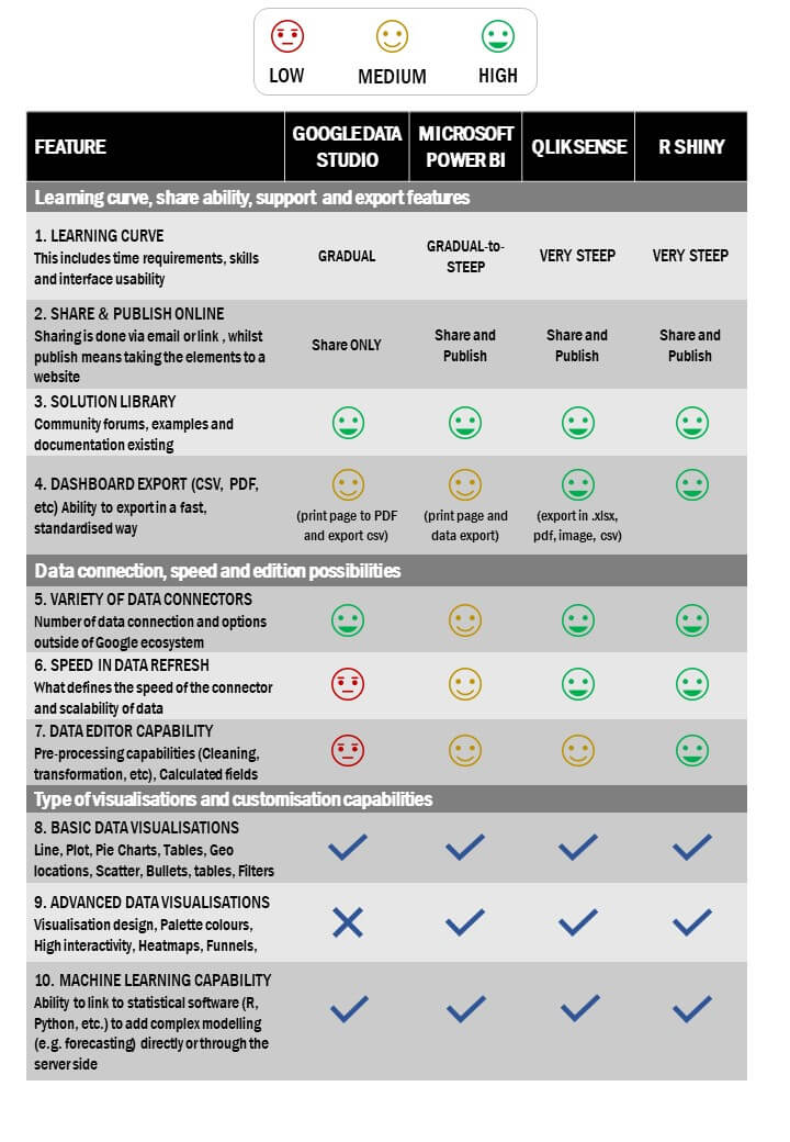
We have developed a specific road-map of visualisation tools that is tailored to the needs of each project/business. We are aware that each company has different requirements, depending on different factors such as: the size of the data, complexity of the task or the type of visualisation, among others. Our Analytics and Research team can help you evaluate which tool would be more suited for the needs of your organisation.
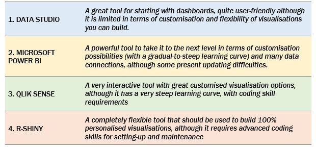
You must be thinking all this information is great, but… in one sentence “Which tool should I use?”
The next post in the “Dashboard Know-How Guide” will dive deeper into dashboards. We will be going through the necessary steps in the dashboard creation as well as describing in more depth the first step in the complexity scale of visualisation tools: Google Data Studio.