Recent studies have shown that the average human in 2017 has an attention span of 8 seconds. This officially means we can focus for less amount of time than your average gold-fish. Great stuff.
Given the fact that consumers are unable to concentrate on anything for longer than a few seconds, while being constantly bombarded by a tidal wave of information everyday, marketers and brands face a slight challenge in getting their content noticed.
I recently went to a talk given by Robin Hüdepohl, the Head of Content Marketing & Information Design at Statista, at this year’s TFM. Robin’s session was titled ‘Pics or it Didn’t Happen: The Power of Infographic’. Somewhat surprisingly, I managed to pay attention well past my 8 seconds, to take note of some excellent points on why infographics and visuals are so essential in our business, and how best to use them.
Here’s what I learnt:
Why you should be using infographics
1. They’re your best bet at grabbing the consumer’s attention
In the vast sea of information, a striking infographic with a clear, attractive design has a better chance of standing out than a block of text. Whether a simple image, or a more involved interactive, marketers can use them to gain attention and stand out from the crowd.
An example of how even the most basic infographic has the ability to demand attention and publicity may be found in the South African airline Kulula. Kulula decided to use a simple illustration to maximum effect by placing humorous labels pointing to different objects on the outside of the plane – for instance, there was a label for the ‘loo (or mile-high club initiation chamber)’. Their witty banter and easy design gained them plenty of attention, and business, with minimum effort and spend.

2. They’re easier to understand & grasp
Translating a block of heavy text into an interesting infographic helps people understand information more easily as it’s condensed, simplified, and aided by visual signals.
When done correctly, they reduce complex issues into smaller bite-sized chunks of information that the reader can digest easily. For instance, they can simplify the word heavy text and complicated data found in things like company reports, helping the reader grasp the information quickly and easily.
A prime example given here was the site http://histography.io/. This incredible infographic is an interactive timeline spanning 14 million years of history, where you can use the interface to target specific years, time periods, events, categories etc. to access or discover historical information. Extremely addictive and useful, it is an excellent example of how effective infographics can make an overwhelming amount of information more accessible and understandable.
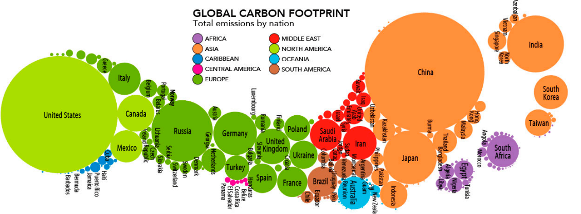
Additionally, when dealing with inconceivable numbers or scale, infographics can help get information across much more effectively than words. For example, this clever infographic shows the global carbon emissions footprint of each nation with a simple drawing of an actual footprint, providing the reader with both perspective and a useful visual comparison without just listing a load of mind-boggling numbers.
3. They’re more memorable
One of the advantages of the infographic is if it’s unique and interesting, people will remember it. Striking visuals will stick in people’s memories a lot longer than a long article.
Infographics can encourage and aid remembrance by drawing on different psychological tricks. The example given here was of ‘framing’, the trick of using a pattern that people are already familiar with to teach new information. Take for instance the well-known Periodic Table of Elements – a familiar pattern drilled into our minds in high-school chemistry classes. This same pattern was used in an infographic listing the shelf-life of different condiments – the ‘Table of Condiments that Periodically go Bad’– an ingenious way of making this content relatable, easily understood and memorable.

4. They tell a more powerful story
Infographics allow marketers and brands to tell a powerful story that has the ability to interest and inspire readers.
This piece recently written on Serena Williams in the LA Times provided an example. The article uses a mix of photographs, videos, graphs, gifs and interactive elements to create a piece that is extremely entertaining, informative and clearly gets the point across while holding the reader’s attention. Thus, infographics help to tell a more complete and powerful story.
How you should be using infographics
While infographic can be a powerful tool, there are a few things to bear in mind before creating them:
- Make sure the form, style & data are relevant to your brand
While infographics may be useful at achieving all of the above, you need to make sure that the form and style you choose are relevant and work well with your brand. For instance, if the majority of your traffic comes from mobile, you need to design an infographic that works well on this platform.
Just like all of the content you produce, your infographics need to reflect your brand values, message and style – don’t just jump on the band-wagon and use them from the sake of it.
- Keep it simple
The whole point of infographics is to make information more digestible, so keep it short and sweet. Simplicity is key.
- Use unique data whenever possible
Readers will engage with, and share, your content when they find it interesting and unique. A surefire way of doing this is by coming up with something completely new and fresh by collecting your own data.
- Create with purpose
Whether you’re looking to inform, educate, entertain, inspire, or something else entirely, you need to have a clear goal for what you want your infographic to achieve.
Pick a goal and stick to it – it is very difficult to get one piece of content to do all of these things at once, and if you try and force it, you’ll probably fail at all of them.
For instance, we created this Device Resolution Cheat Sheet for designing for mobile that has been used numerous times – hardly inspiring, but it gets the required information across clearly and simply.
Interested in how other companies are using infographics? There is, of course, an infographic of this, courtesy of Ivan Cash.

Do all of this correctly, and infographics will increase your traffic and SEO, as well as help build your brand. A powerful tool, indeed. If you need any help with your creative content, get in touch with us and we’ll be happy to help.